Have you ever noticed how there are multiple tech companies with logos and branding that are blue? Think Twitter, Facebook, and LinkedIn and that is just for social media. Then there are companies like Salesforce, PayPal, GE, HP, Boeing, and Samsung who all choose to go the same route. The same goes for health food stores or brands. They all tended to go for green like Whole Foods, Natural Grocers, and even Subway. So what is the reason why so many companies in similar industries decide to have the same color branding? Well, it all has to do with the psychology of colors.
Colors often have certain emotions and feelings that customers associate with them. Color can say a lot about a brand and can leave a long-lasting impression. Visual recall is not something to undermine. There are many toddlers around the world who can recognize those famous golden arches and know that represents McDonald’s before they can even read.
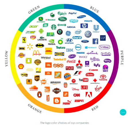
Each of these colors gives the consumer a certain kind of feeling. Green represents harmony, nature, health, and renewal. That is why you will see brands like Whole Foods, Animal Plant or John Deere. Blue represents trust, loyalty, power, authority, and professionalism. These are traits that many of the largest companies want to portray. Purple depicts royalty, luxury, education, and celebration. Brands like Yahoo and NYU want to been seen as an educator while other companies like twitch and Syfy are in the entertainment industry. Next, red stands for passion, love, anger, hunger, health, excitement, and life. Coca-Cola is a great example of this because they try to showcase many of those qualities (besides anger) in their marketing efforts. Orange represents vibrancy, playfulness, artistic and happiness. Nickelodeon, the television network that focuses on kids and teens uses this color to show just those traits. Finally, yellow shows warmth, innovation, and at times, caution. Whereas blue logos tend to represent tech companies, yellow logos are a bit more diverse in the industries they represent. You have Snapchat, UPS, Walmart, StarWars, and Lays.
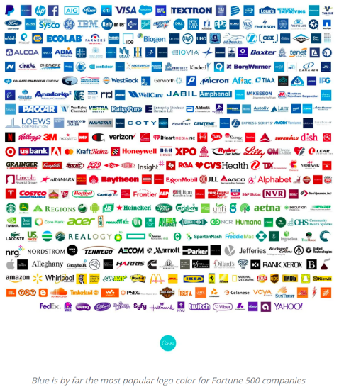
Of the Fortune 500 Companies, there is a definite trend in the colors of their logos. Blue logos stand out with about ⅓ of them having that color scheme. This is followed closely by red. However, it is also important to note that with many of the blue logos, there are red accents and with many of the red logos, there are blue accents. These two primary colors far overshadow logos that are pink, purple, yellow, or orange. So if you are looking to find the perfect color for your logo, consider what customers might think of or associate when they see it.
Keep Reading Brand Iron Blogs!
Tips for Returning to the Office as Told by Memes from The Office
Here are some easy tips to follow for returning to the office, told through our favorite means of communication: memes from The Office.

Lead Generation Through Organic Marketing
If you struggle with increasing your website traffic, you are not alone. There are many ways to get leads from the organic traffic that is already…
CEO | Brand Champion
Michael Doyle has been changing the face of Brand Marketing for over two decades. He built a tech-based advertising agency, DNA Advertising, into a multi-million dollar company. Michael sold the company as part of a national IPO in 2000. Michael founded Brand Iron in 2002 and has since lent his expertise to hundreds of other businesses in dozens of industries around the world.